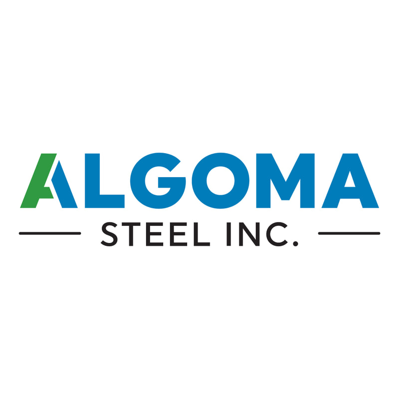
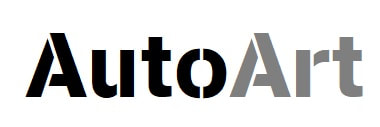
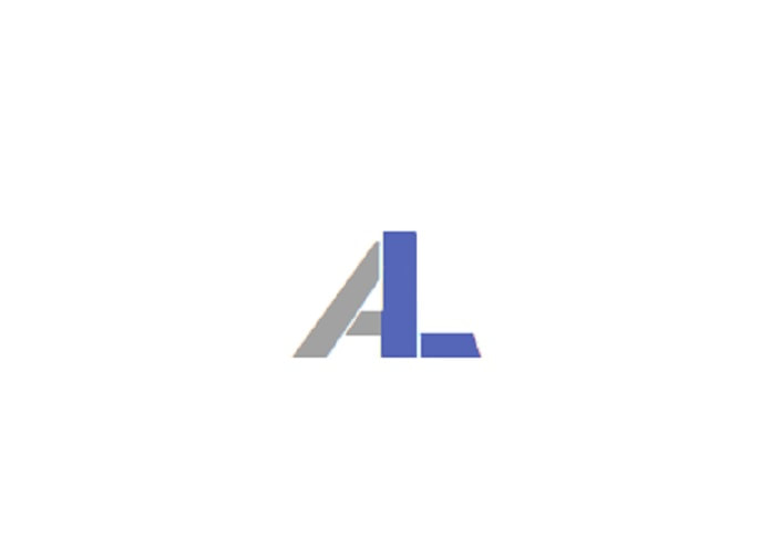
Algoma's use of the AutoLooks font 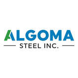 We are always glad to meet a fan and in some ways are flattered if they want to use us for their own work. But it seems that a fellow northern company has decided to use the same font as us. Sure we were flattered when we found it as maybe this will help drive some more viewers to our site and vice versa. But it was uncanny as to how much the new logo for the newly formed Algoma Steel Inc. was to that of our AutoArt page (see blow for reference). Now we all know that you can't go after someone for using the same font, but the use of the two tone colour is unreal. Seems that someone at the previous Essar Steel liked our page a little too much. So much so that they thought they could utilize our image to help boost the image of the newly formed Algoma Steel Inc. The funny thing about this, is that Algoma Steel supplies steel to the automotive world, helping build parts for the vehicles we rate. Along with that they also hail from North Eastern Ontario as well, making us both Northern companies. So I guess you could say this font is highly used up north. Ah well, we really don't care as it is only a font face and colours don't mean anything. But if Algoma needs a little help with some traffic, then let us know and maybe we could both help each other out. Check out Algoma's site for more information about the steel maker: https://www.algoma.com/ Everett J. @AutoLooks, #AutoLooks, AutoLooks.net
0 Comments
Leave a Reply. |
Categories
All
AuthorLooking to see where Everett J. came from or how he knows so much about the industry he loves. Then check out his page: |
FOLLOW US ON SOCIAL MEDIA:
Copyright Ecomm 2004-2023
